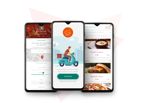
DeliverIt
- Year 2017
- Role UX & VIsual Designer Consultant
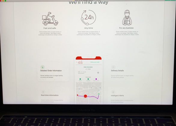
With our platform, end-users no longer need to use the app to place an order. Our system allows customers to request orders through any channel – whether it’s by phone, website, or even the restaurant’s own app. Our focus is on partnering with businesses that are interested in tapping into our qualified delivery base, which is available 24/7.
Please note that this is currently a beta version of our platform.
Teste Goal:
Make the app more attractive and increase the base of registered restaurants by 50%.
About A/B test
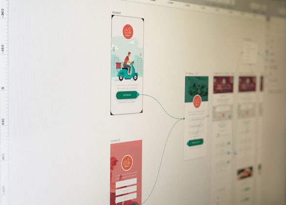
The test consists of the release of different versions of the same interaction interface in order to evaluate the best performance between 2 options.
Criteria
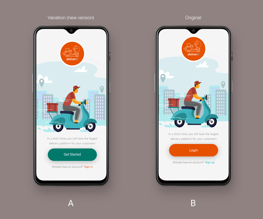
In our case, two versions of the Legal Entity Registration screen will be released.
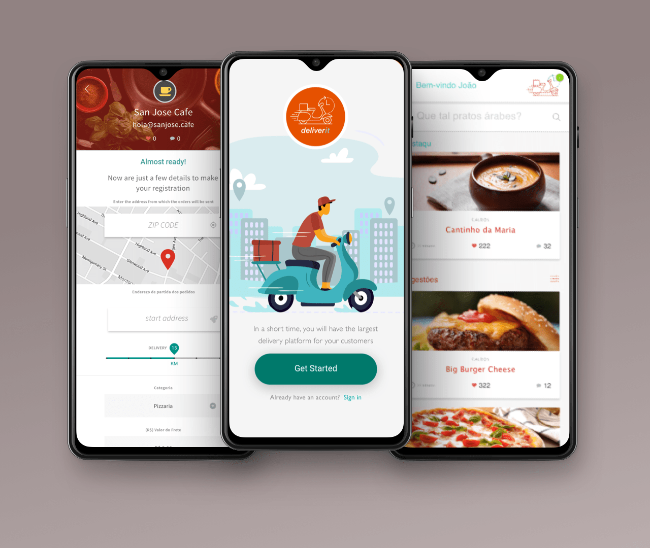
Version A – New version, clean and with highlighted call-to-action, without forms, the secondary colors of the brand predominate (green).
Version B – Original version, warm and relaxed, with a background alluding to the delivery system. The form on the first screen.
Hypothesis
Currently, we’re experiencing a high dropout rate on the PJ registration form in comparison to our conversion rate. Approximately 20% of users are abandoning the form before completing it and we beliefe that we have to take litle changes in user interface.
To address this issue, we’re recommending a backdoor test with a sample of 280 users to validate the hypothesis. In order to mitigate the impact of chance, we’ll set the statistical significance level at 95%. By doing so, we hope to gain valuable insights into the reasons behind the high dropout rate and make data-driven decisions to improve the user experience.
Test detail
Key product performance indicators
Brand Consistency
How many times the application is shown in the search results on different platforms and social media.
Indicate improvements in keywords, in addition to redirecting engagement campaigns on social networks.
Measurement of user interest
A separate number of downloads, installations, and removal of the app for each version made available, a campaign carried out and platform.
In this way, measure the primary and secondary impact of the releases delivered.
App home page dropout rate
The number of users who do not start using the app because they have not passed the first screen.
Elaborate actions to mitigate the withdrawal of conquered users without the minimum deepening of the product proposal.
Navigation time and tasks
In particular, forms, seek improvement in the implementation of forms that encourage the enrichment of the base of companies available on the app.
A funnel to measure the average time spent in each section until the completion of the main activities.
Withdrawal rate
Check for withdrawals in key tasks of the app: PF registration and order completion (end-user).
Search and navigation
Metric to measure the efficiency of the app organization (Information Architecture), specifically on the Dashboard, as the time spent searching for the desired (and sometimes unknown) items decreases the conversion rate
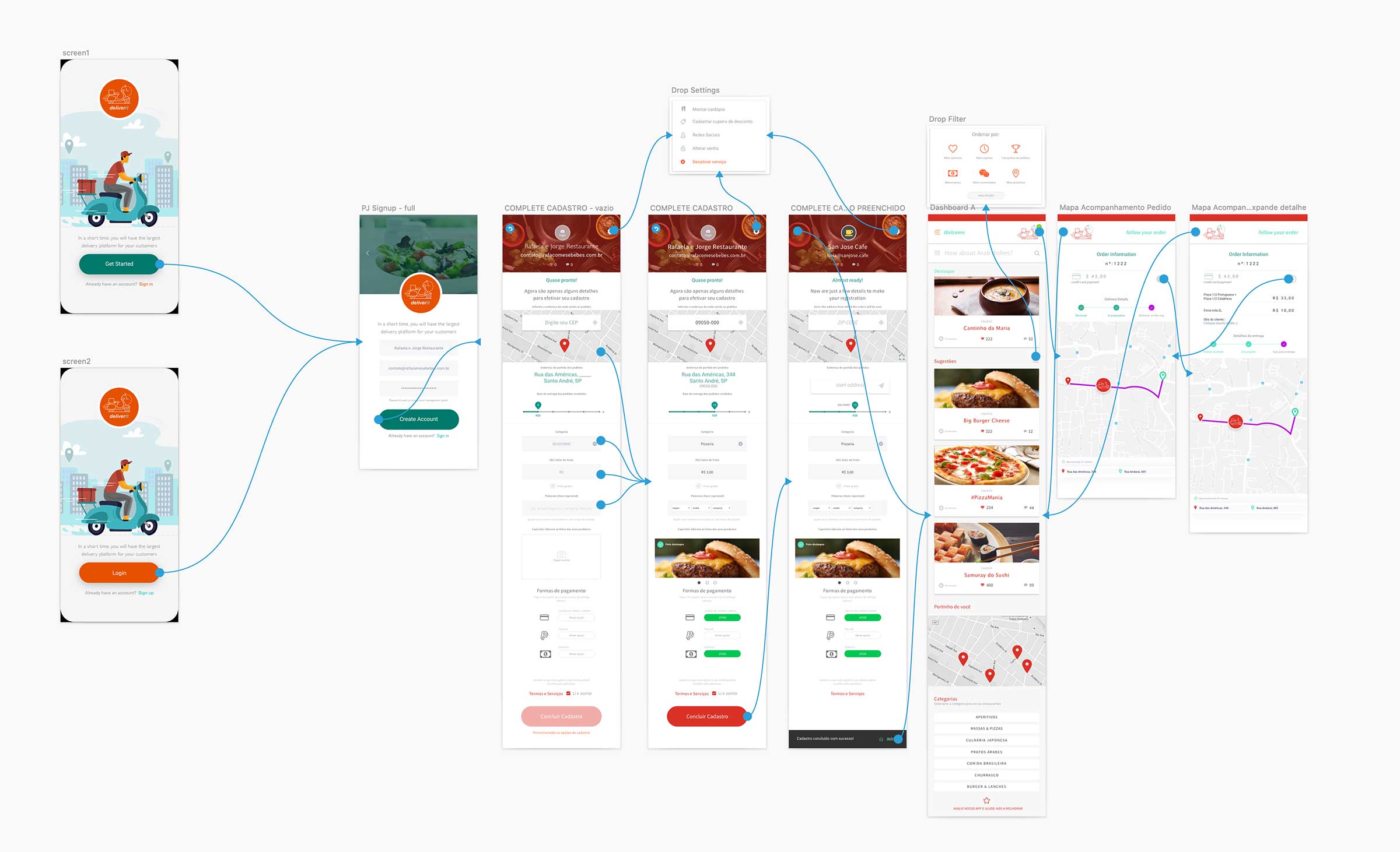
Prototype test overview
Conclusion
A brief summary of the conclusions.
Determined result
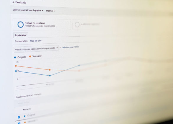
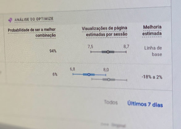
We use the Google Optimizer tool to calculate the result after implementation. After the performance showed a big difference between the versions, we feel free to end the test after 185 sessions with a probability of 94% of the new version being the best option.
Decisions
In addition to changes to the Landing Page itself, it was defined that one of the main actions was to try to understand if the customer had real knowledge of the app’s purpose. After this test the recommendation to conduct qualitative research before launch for business refinement.
