
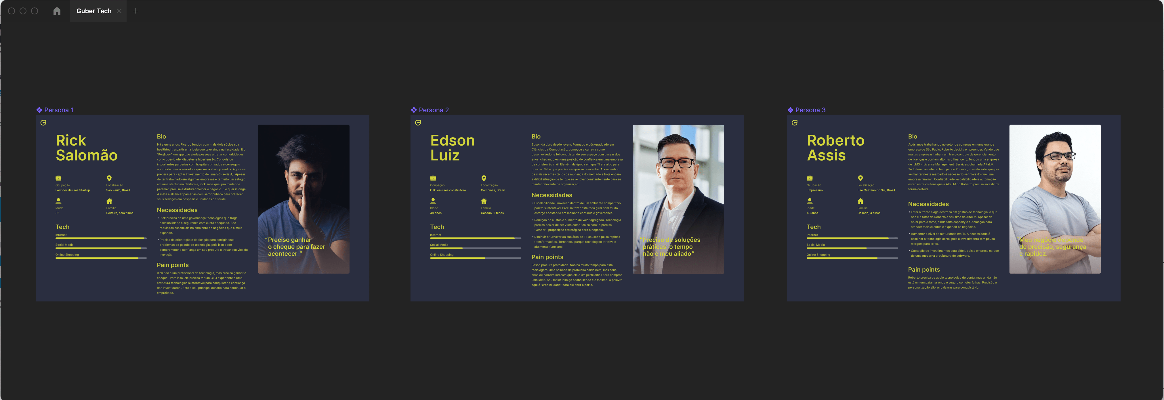
To demystify and identify the browsing behavior triggers of Gubertech’s user types, we built 3 personas, which represented the extreme profiles of the startup’s customers.
Gubertech
- Client Gubertech
- Year 2022 • 2023
- Role Product Design & UI Development
A Website rebrand focused on UX optimization, Design, SEO, and traffic improvement.
The purpose of Gubertech is to offer the CTO as a service, the hiring of technical and business advisory services from a Chief Technology Officer to assist a startup or a company.
Every website redesign project has a specific journey. It’s essential to understand why the client has requested this work. What are their goals, and what current problems they are facing, among other factors. That’s why in design, there isn’t always a one-size-fits-all solution.
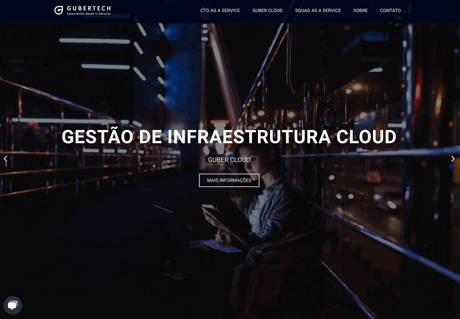
Problem Statement • old version
Through campaigns and intelligence, Gubrertech managed to get good traffic on its website, showing that this was not a difficulty. The problem is in the delivery of the site to the end-user. Browsing flow analyzes showed clear demonstrations that potential users of the technology company were unable to find themselves on the site.


A bit more
Users’ lack of interest in continuing to understand the company’s value proposition, evident lack of conversion through the website. we have a few seconds to hold the user on the site. If we give away too much information, he loses interest.
Challenge
The big challenge was also how to convert traffic into real potential customers. Would a series of small fixes to usability, information architecture issues be enough?

Sharing some insights from Google Analytics
It is important to note that this is not academic or scientific research. The following collection is just the main insights we used to define understanding the problem.
General flow
Almost 50% of website traffic comes from referral channels and social networks are solid in capturing leads.
Direct traffic
Direct traffic represented about 30% and the rest came from organic searches, Google ads and others.
Bounce rate
The behavior flow shows a strong bounce rate on the first interaction – 40%, which indicates the need for analysis of the first impression
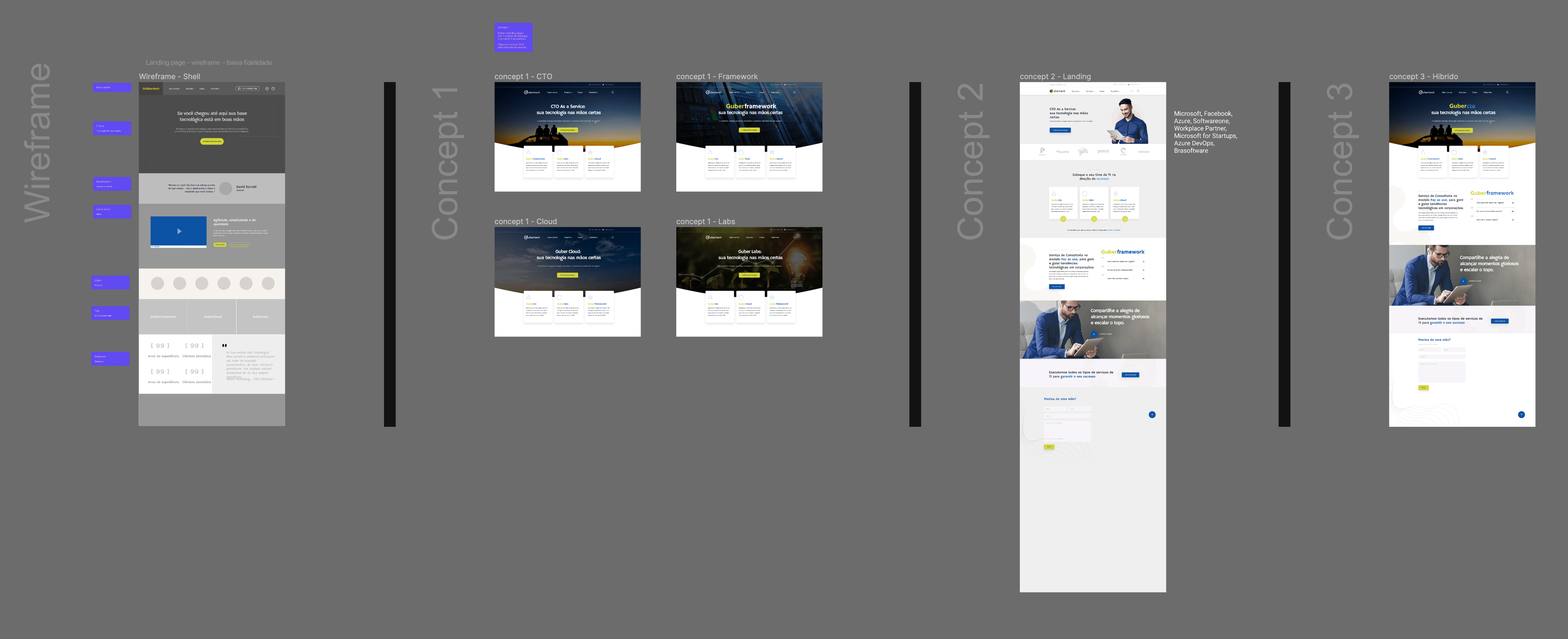
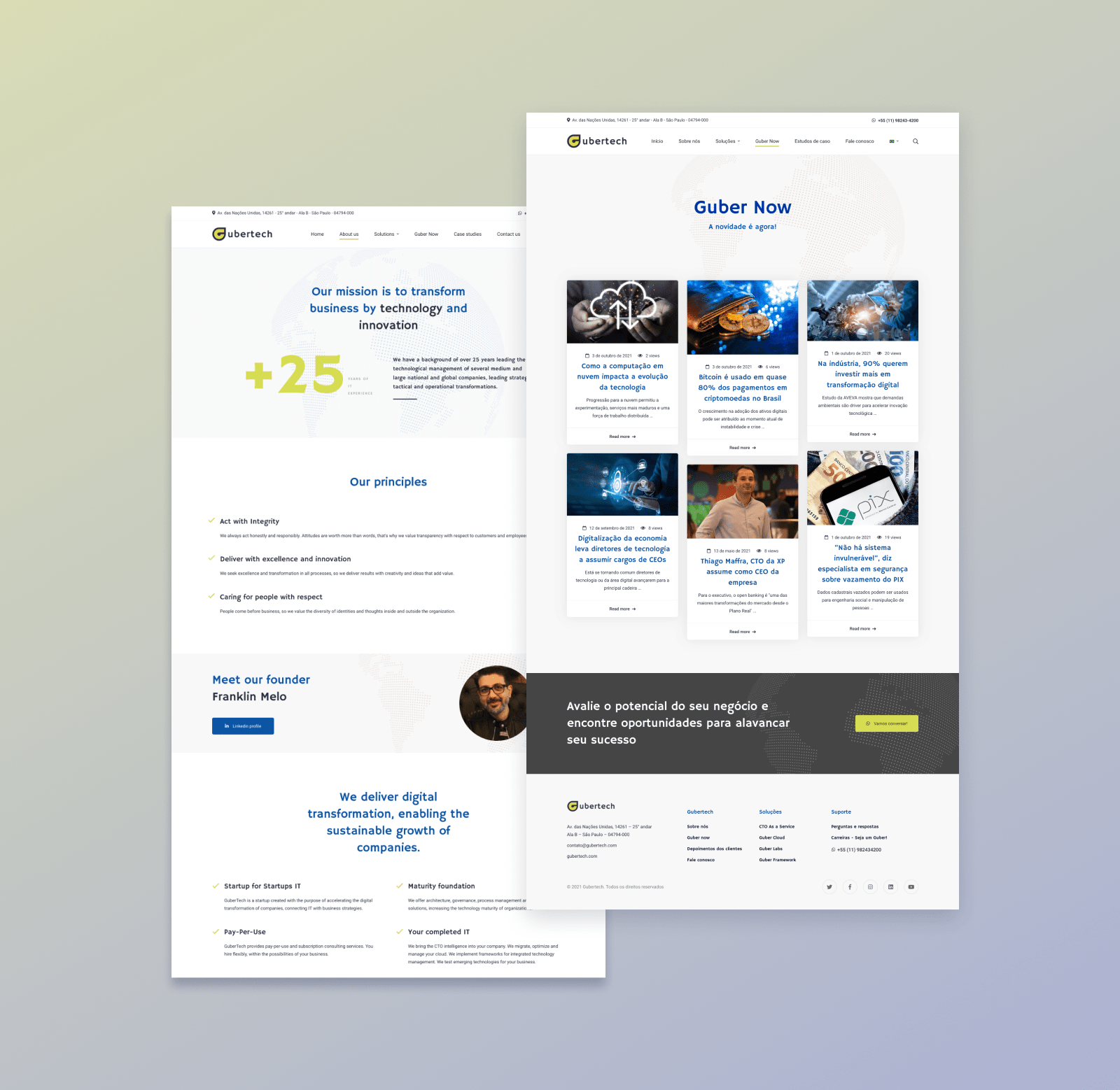
Conceptualization and language
This site went through several stages of analysis before design.
Most of the effort went into rethinking the site’s semantic structure, as users didn’t understand the terms and were rarely interested in exploring the site, due to complicated navigation.
After extensive work focused on the new Information Architecture, with card-sorting and user tests, we set out to compose the concept of the new look for the site, whose challenge was to be more attractive and connected with the user profile we were trying to attract.
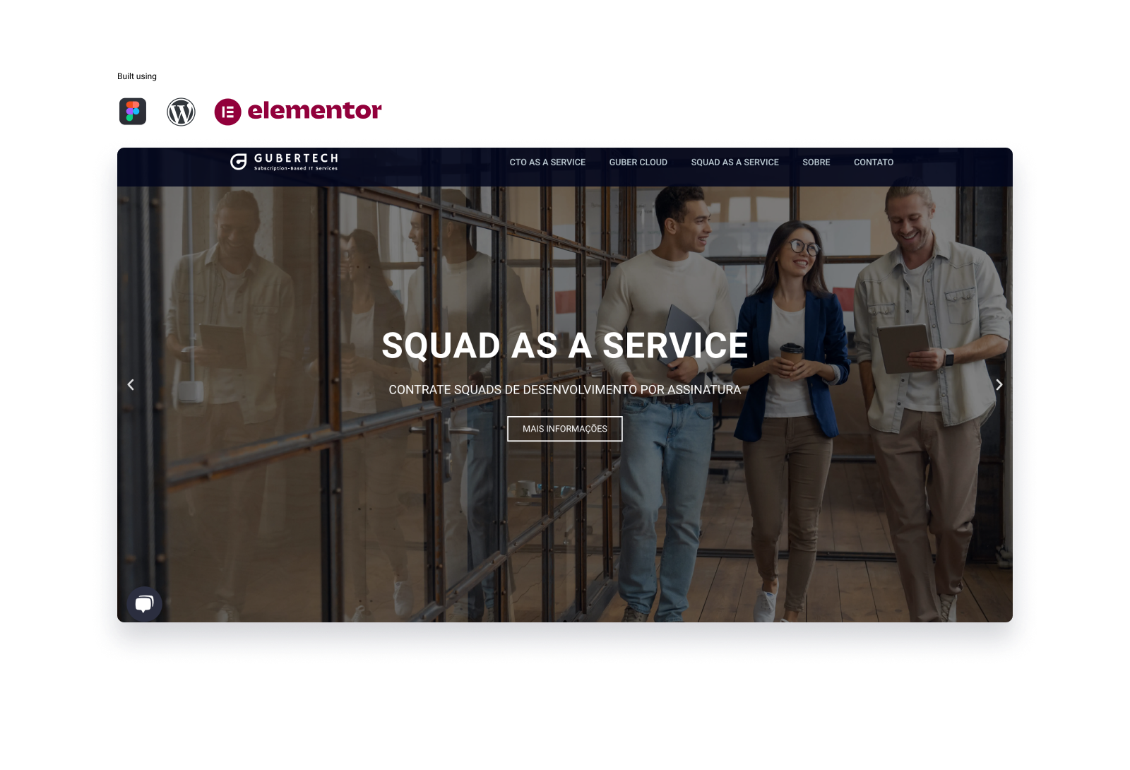
Onepage Navigation
Outcomes achieved
Following the release of the redesigned website, we observed a considerable increase in browsing duration and, more notably, a significant rise in contact form submissions. As a consulting business, this communication channel is vital for us.
In terms of percentages, there was a 113% increase in form submissions, and the site’s ranking on Google search indices improved 7x.